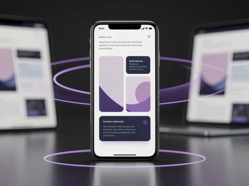
Mobile devices account for well over half of global web traffic, making strict mobile optimization a mandatory baseline for WordPress developers. Achieving excellent Core Web Vitals on mobile has historically been a challenge for those using robust page builders. The release of Divi 5 fundamentally changes this dynamic. By completely rebuilding its core foundation and abandoning legacy shortcodes in favor of a modern, structured data model, developers now possess the exact tools required to prioritize speed and agility. Mastering Divi 5 mobile first design is not merely about making elements stack neatly on smaller screens. It is about engineering fast, lightweight, and highly interactive user experiences from the smallest device upward.
The Architectural Shift for Mobile Performance
When discussing mobile performance, code bloat is the absolute enemy. Previous iterations of page builders relied heavily on shortcode parsing. This backend processing increased Server Response Time and slowed down mobile rendering, particularly on devices with weaker processors. Divi 5 resolves this historical bottleneck by removing shortcodes entirely. Instead, page data is processed and stored in a clean, JSON-based format.
For developers, this architectural shift means mobile browsers no longer struggle to parse heavy backend code before painting the screen. When you build a layout in the new environment, you are shipping a significantly leaner Document Object Model. This inherently boosts your ability to pass mobile Core Web Vitals, specifically targeting Largest Contentful Paint and Interaction to Next Paint. A mobile device requires fewer CPU cycles to render a Divi 5 page, resulting in immediate visual feedback when a user scrolls or taps.
Implementing a true mobile-first approach requires starting your design process with the mobile viewport actively selected in the builder. Rather than designing a massive desktop hero section and struggling to compress it into a narrow screen, you engineer the mobile container first. You define the essential text, the minimal padding, and the primary call to action. Only after the mobile foundation is perfectly optimized do you scale the layout up to accommodate larger desktop screens.
Mastering the Seven Responsive Breakpoints
Perhaps the most significant upgrade for responsive control is the introduction of highly customizable breakpoints. Divi 5 introduces seven specific responsive breakpoints: phone, phone wide, tablet, tablet wide, desktop, widescreen, and ultra-wide. By default, three of these are active, but developers can toggle all seven based on specific project requirements.
This level of granularity allows you to execute precise Divi 5 mobile first design strategies. Instead of relying on a single toggle that lumps wildly different device sizes together, you can specifically target the 480px to 767px range using the phone wide setting. This prevents awkward typography breaks that might look fine on a modern smartphone but fail completely on older, narrower devices.
To leverage these new breakpoints effectively in your workflow, consider the following approach:
- Start with the base phone breakpoint to set your universal typography variables, ensuring fonts are highly readable and interactive elements are sufficiently spaced.
- Activate the phone wide and tablet breakpoints only when your layout organically breaks or looks unnaturally stretched, rather than forcing layout changes at arbitrary pixel widths.
- Preview these exact viewport widths directly inside the builder to ensure your CSS flex or grid settings behave predictably before pushing the site to production.
By working from the narrowest breakpoint upward, your base styles remain simple. As the screen expands, you selectively add complexity, rather than starting with a complex desktop view and writing endless CSS overrides to hide things on mobile.
Optimizing the DOM and Asset Delivery
A visually appealing mobile design offers no value if it takes five seconds to load on a standard cellular connection. While the new Divi 5 engine significantly improves backend processing, developers must still write intelligent, resource-conscious layouts to maximize these benefits.
A common mistake in responsive design is hiding massive desktop elements on mobile viewports using a simple display toggle. While this visually removes the element from the screen, the browser still downloads the HTML markup and associated background images. This wastes precious mobile bandwidth and degrades performance. Instead, utilize advanced conditional rendering logic or design adaptive sections that use CSS Flexbox to rearrange content naturally without duplicating modules.
Furthermore, you must limit your use of deeply nested rows. Every time you place a column inside a row inside a section, you add redundant nodes to the structure. A high depth slows down mobile rendering and triggers performance warnings in auditing tools. The streamlined interface encourages much flatter layouts. Rely on intelligent padding and margins within a single comprehensive module rather than creating separate spacer modules or unnecessary wrapper containers.
Typography and Touch Target Standards
Designing for human thumbs is a critical aspect of mobile-first engineering. Users interact with touchscreens differently than they do with a precise mouse cursor. The physical constraints of mobile hardware dictate exactly how you should space your interactive elements to prevent user frustration.
Ensure all buttons, form fields, and accordion toggles maintain a minimum interactive area of 44 by 44 pixels. If two text links sit next to each other in a footer, add sufficient margin between them so a mobile user does not accidentally tap the wrong link. The global presets feature is highly useful for this task. You can define a standardized mobile button global style that automatically enforces these touch-target standards across your entire website, ensuring absolute consistency.
Typography scaling is equally crucial to the mobile experience. A large heading looks authoritative on a desktop monitor but will cause ugly, hyphenated line breaks on a small screen. Utilize modern CSS functions like clamp directly in your custom fields, or rely on responsive text sizing to ensure fonts scale fluidly. A standard practice for mobile accessibility is to set body text no smaller than 16 pixels, paired with a line height of at least 1.5 for optimal readability on bright, compact screens.
Conclusion
Transitioning to a mobile-centric development workflow requires a shift in both technical execution and overall mindset. By leveraging the updated lightweight architecture, utilizing the granular new breakpoints, and maintaining strict control over page structure, developers can build exceptionally fast and visually stunning websites. Implementing effective Divi 5 mobile first design means you are proactively engineering for the platform where the vast majority of your users actually live.
For development agencies and freelance professionals looking to streamline their workflows and build robust sites that consistently pass Google’s strict performance tests, partnering with technical specialists can rapidly accelerate your success. Divi Guru provides the expert guidance, custom development, and strategic support you need to maximize the potential of the new Divi ecosystem. By working with Divi Guru, you ensure your client projects remain lightning-fast, highly optimized, and positioned as industry leaders in an increasingly mobile-dominated web.